Showing posts with label Sam Gilliam. Show all posts

02 July 2022

Sam Gilliam (1933-2022): A Personal Tribute


[As you’ll read below, my parents had a small art collection, consisting of some 40 oil paintings, watercolors, prints, sculptures, and a tapestry.  When my mother died in 2015 (my father had died in 1996), the collection was too large for me to display in my New York City apartment.  Shortly after Mom’s death, I offered the art to my undergraduate alma mater, Washington and Lee University in Lexington, Virginia, of which my father was a devoted alumnus.


[In September 2016, the University accepted the loan proposition and on 6 November 2017, an exhibition of the collection opened in W&L’s Stan Kamen Gallery at the Lenfest Center for the Arts.  After A Passion for Art closed on 30 June 2018, the collection became available for art classes and rotating display in various locations around the campus.  (W&L has no permanent art gallery.)]


My parents collected art from about 1948 to 1995 (see “A Passion For Art: My Parents’ Art Collecting,” posted on Rick On Theater on 21 November 2017).  This activity took off after September 1958, when, as some readers of Rick On Theater will know, my folks became part owners of Gres Gallery, a modern-art gallery in Washington, D.C. (see “Gres Gallery,” 7, 10, and 13 July 2018). 


The gallery closed in 1962, but the art collecting continued until my father’s death.  The art in my parents’ home originated in many periods (pre-Columbian Mexico, 18th-century Europe, 19th-century China) and regions of the world (Mexico, South America, the Caribbean, Africa, Europe, Asia), but the majority of the works are contemporary American painting and sculpture, including some Native American pieces (Fritz Scholder [1937-2005; see my post on 30 March 2011]).


Some of the artists with works in my parents’ collection were longtime friends (Minnie Klavans [1915-99], Lila Oliver Asher [1921-2021; see my post, 26 September 2014]) and others, like Sam Gilliam and sculptor Leonard Cave (1944-2006), became friends.  Gilliam, 88, died of renal failure at his Washington, D.C., home on Saturday, 25 June.

Sam Gilliam in his studio in 2018

Mom and Dad owned three of Gilliam’s works (and I own one) and they visited the artist’s home and studio in Mount Pleasant in northwest Washington, D.C., and the galleries of his partner (since 2018, his wife) and manager, Annie Gawlak. 


A couple of times I accompanied Mom to Gawlak’s gallery at the time, G Fine Art (located first on M Street in Georgetown and then on 14th Street in Logan Circle; now closed), just to see what she was showing, and on one afternoon, I went with my folks to the Gilliam house to chat and see what the artist was working on.  I was also visiting my parents on several occasions when the Gilliams came to their home.


Sam Gilliam, an African-American painter, was born in Tupelo, Mississippi, on 30 November 1933.  He grew up in Louisville, Kentucky, and came to Washington in 1962.  He’s considered part of the second generation of the Washington Color School, a mid-20th-century (1950s-1970s) form of abstract art growing out of color field painting which dealt with the effect of light on color (see my post “The Washington School of Color,” 21 September 2014).  


Gilliam often worked in diverse styles and forms, changing as he discovered new effects and techniques.  The Gilliam I have, Flowers (1989) from the Tulips series, is a mate to one from my parents’ collection, Petals from the same series, but the other two in the collection—Chinese, an acrylic work on shaped canvas from 1990, and a small, untitled, 1995 mixed-media collage on irregular hand-made paper—are different from each other and from Flowers and Petals. 
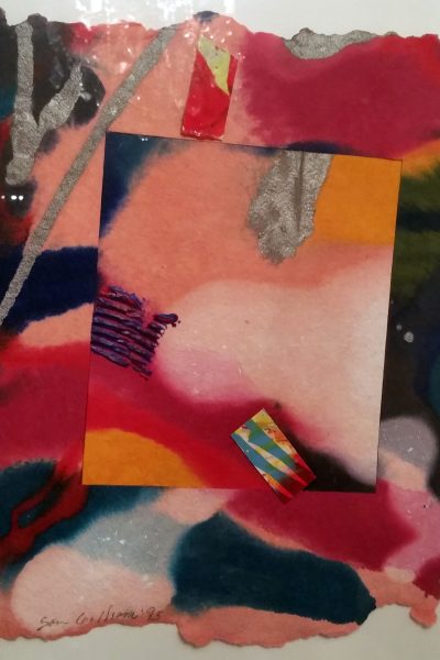
Untitled mixed-media collage

Gilliam, prolific and innovative, experimented with many media and varied his application as the medium demonstrated its properties.  I went to Sam Gilliam: A Retrospective (see “Awake and Sing!, et al.,” 3 April 2017), an expansive exhibit at the Corcoran Gallery of Art in Washington (15 October 2005-22 January 2006), with my mother, who’d also been invited to the opening, and we found that the show didn’t include any works resembling ours or other pieces I knew Gilliam had made. 


For instance, his short 2002 series, Slats, exhibited at the Marsha Mateyka Gallery near Dupont Circle (5 April-25 May 2002), was a collection of geometric, brightly monochromatic, hard-edged constructions the likes of which Gilliam has never repeated.


One afternoon while window-shopping on Wisconsin Avenue near Tenley Circle, I saw a decorated chair that looked like it had been painted in the same style as Chinese, the formless canvas of many-colored acrylic in my parents’ collection. 


The piece in the gallery window was an ordinary ’50s/early ’60s style kitchen chair covered with multicolored, thickly impastoed acrylic paint in the same style as the “ribbons” that are woven through the shaped canvas of Chinese.  Mother and I agreed that it must be Gilliam’s work, so we asked in the shop and we were right—and yet, the painted chair didn’t resemble Chinese in any other respect.
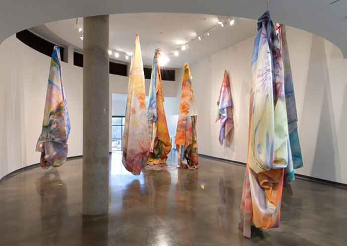
Close to Trees at the Katzen Center


On another of my visits to Washington, Mother and I drove over to American University’s Katzen Art Center on Ward Circle to see Sam Gilliam: Close to Trees (2 April-14 August 2011; discussed in “Picasso, Bearden, Gilliam, and Gauguin,” 26 June 2011), an exhibit of draped nylon and polypropylene cloths brightly dyed with acrylic colors, especially created for the Katzen’s third floor.  Gilliam had transformed the space into a forest of color which visitors walked around and past as if strolling through a grove of trees. 


The artist had worked with draped fabric before—a project in Japan in the 1990s that led to a site-specific installation of painted cloth at the American Craft Museum (now the Museum of Arts and Design) in New York City in February-April 1992.  The exhibit was accompanied by a talk on 19 November 1991 on the textile work in Japan that I attended.


Indeed, an increasing amount of Gilliam’s work from the ’70s on was with unframed, unstretched, formless paintings that was distinct from the habitual work created by his fellow Washington Color School artists.  He’s often described as having liberated color painting from the flat, two-dimensional format that was the standard among first generation WCS painters.


The drape paintings appeared in Gilliam’s career as early as the 1960s and ’70s, when the artist essentially invented the form.  He took the canvas off its traditional stretcher, stained it with vivid colors, and then draped the fabric on the walls, from the ceilings, or over props. 


A drape painting is a blend of installation, painting, and sculpture.  Each installation is different, and Gilliam is strongly guided by the way the light of the display space plays on the folds of the painted fabric.  The element of improvisation, both in the creation and the display of his art, is a great part of what excites me about Gilliam’s work.  It evokes Jackson Pollock (1912-56; see “Jackson Pollock: A Collection Survey: 1924-1954,” 4 March 2016) and Morris Louis (1912-62; see “Morris Louis,” 15 February 2010) with respect to Gilliam’s innovative technique.


Though Louis, a Washington School artist who painted in the ’50s and ’60s, abandoned stretchers and easels in the mid-1950s, pouring paint directly onto canvases laid out on the floor of his dining room, he framed the results in the traditional rectilinear format after he finished the piece.


Annie Truitt (1921-2004; see “Art in D.C. (Dec. ’09-Jan. ’10),” 18 January 2010), another first-gen Washington Colorist, abandoned canvas altogether, making painted wooden columns her signature art form.  Most WCS artists, however, stuck with stretched, usually primed—Louis worked on unprimed canvas, and Gilliam used unprimed fabrics of various composition—as their medium of choice.
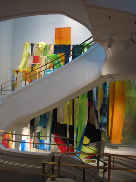
Flour Mill at the Phillips Collection


In 2011, Gilliam created a work specifically for the elliptical staircase of Washington’s Phillips Collection.  This site-specific installation of draped, painted fabric, which the artist dubbed Flour Mill—it was inspired by 1938 abstract painting Flour Mill II by Arthur Dove (1880-1946), owned by the Phillips Collection—though itself abstract, was meant to evoke something specific and concrete.  Gilliam’s Flour Mill was on view 29 January-24 April 2011 to help mark the Collection’s 90th anniversary.

Gilliam exhibited frequently with galleries across the country (David Kordansky Gallery, Los Angeles; Pace Gallery, New York and London; Marsha Mateyka Gallery, Washington, D.C.; Galerie Barbara Weiss, Berlin) and his works are in the collections of many museums around the world. 


His first museum show was at the Phillips Collection in 1967; among the other prominent collections that include Gilliam’s work are the National Gallery of Art, the Hirshhorn Museum and Sculpture Garden, and the Smithsonian American Art Museum, all in Washington; the Museum of Modern Art, the Whitney Museum of American Art (see “Spilling Over: Painting Color in the 1960s (Whitney Museum of American Art)” in “Hopper and Turner at the National Gallery & Color Painting at the Whitney,” 23 April 2019), and the Metropolitan Museum of Art, all in New York; London’s Tate Modern; and the Musée d’Art Moderne in Paris.


While the drape paintings dominated Gilliam’s work in the latter part of his career, he didn’t stick exclusively to that medium.  He returned often to draping, but moved into other forms as the impulse stimulated his imagination.  He was a lifelong, tireless experimenter.  The decorated chair and two of my parents’ three Gilliams—as well as my own piece—are examples of the artist’s flexibility.
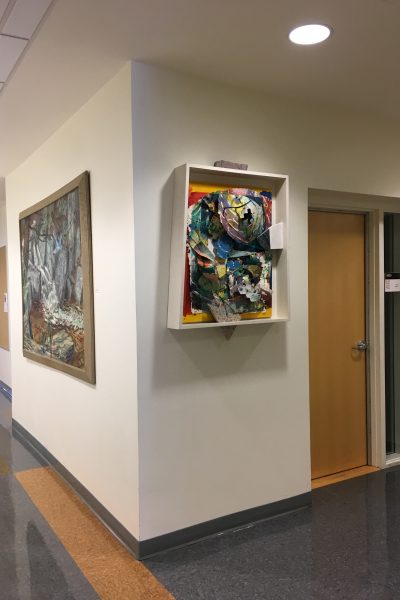
Petals at W&L University

For example, one of Gilliam’s visits to my parents’ apartment was in August 1989.
  The artist had offered my parents two pieces from his Tulips series, which he described as assemblages on handmade paper with marble, mounted in constructed boxes, in exchange for an investment in the project.  My folks were giving me one of the monoprints, so I was present when Gilliam brought the pieces for my parents to see. 


Gilliam himself mounted Petals for my parents because it takes a special bracket fixed to the wall, onto which fits a wooden flange on the back of the box frame, which is very heavy because of its construction and the addition of the marble “appendages.”  (While my piece, Flowers, is square, Mother and Dad’s Petals isn’t, so mounting it plumb required a sharp eye . . . or a modicum of luck!)


My dad and I had to install Flowers ourselves when we got it to my Manhattan apartment.  The artist, though, had thoughtfully made an instructional diagram of the mounting process, adhered to the back of the wooden box, for this purpose.  The print, as Gilliam called these works, has pride of place in my apartment: on the living room wall directly opposite the sofa. 


Flowers is easily one of my most favorite pieces of art in my own small collection.  (Sharing that honor is an Alexander Calder [1898-1976] lithograph entitled Magie Eolin (1972)—the nearest translation for which I can come up with is “magic of the wind.”  It hangs opposite Flowers, above the sofa.  [See “Calder: Hypermobility at the Whitney,” 21 August 2017, and “Alexander Calder: Modern from the Start (MoMA, 2021-22),” 28 January 2022.])


Gilliam came to my folks’ home again in March 1990 to hang Chinese, an unframed, shaped canvas with ribbons of painted canvas that must be woven through it.  It’s therefore formed differently every time it’s hung and takes on a completely different character depending on who’s done the installation. 
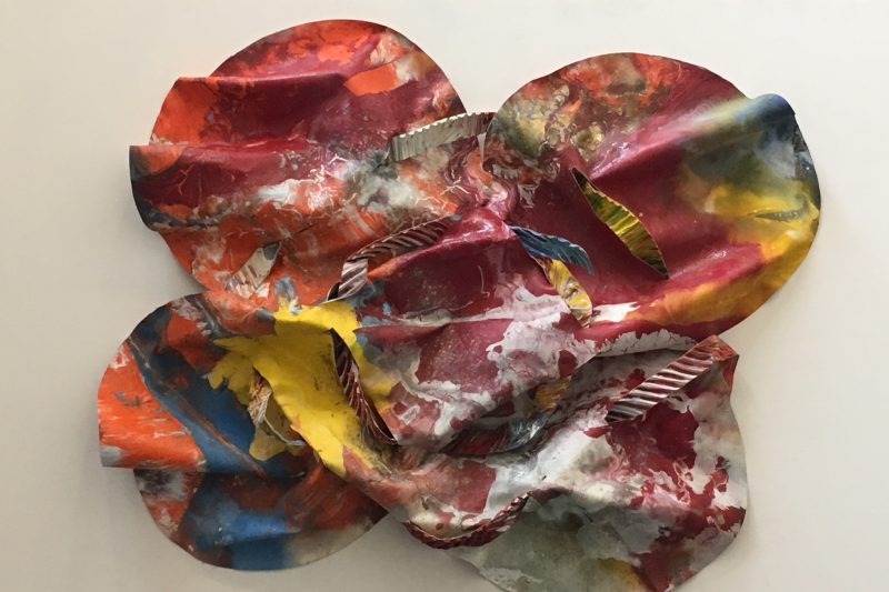
Chinese


Gilliam hung Chinese, which the artist defined as “an acrylic [painting] on canvas, woven and assembled, mounted directly on the wall in the manner of the drape paintings of the late 60’s and early 70’s,” in my parents’ dining room so that it bent around the corner of an entranceway into the living room. 


A derivative of the draped pieces, Chinese has no predetermined and immutable shape, no frame, no definitive dimensions, but it’s somewhat more rigid than the thinner fabric allows the drape painting to be, and has to be fastened to a wall or panel of some kind.


(When the University curator was planning not just the initial exhibit of my folks’ art collection in Lexington, but the eventual display of the artworks in various buildings on the campus, this became a conundrum.  W&L is almost 275 years old and there are many buildings on the campus that date back to the days of George Washington; the University doesn’t permit the use of nails on the walls—including the walls of the Kamen Gallery, though for different reasons.
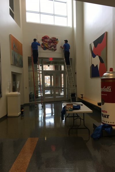
Mounting Chinese at W&L.
Note the mounting board.


(Framed art can be hung in many ways that don’t require putting nails and hooks into ancient plaster walls, but Chinese was designed to be nailed directly to its mounting surface.  What to do?  I suggested mounting the painting on a board and hanging the backing the way the curator would hang a framed work.  I believe that’s what she did.)


Gilliam returned in the mid-1990s to rehang Chinese—a title I didn’t even know until the curator of the University Collections of Art and History at W&L discovered it while mounting the collection for its introductory exhibit in 2017—when Mother moved to a smaller apartment in her building. 


I was with Mom and whimsically suggested that the painting should climb up onto the ceiling—so a lobe reached up onto the ceiling in Mom’s new sitting room.   The painting is rather large; unfurled, it’s approximately 48" x 48".


When Mom moved to Bethesda in October 2013, I mounted Chinese, under Mother’s direction, in the living room and it climbed onto the ceiling again, but I wasn’t as pleased with the result as I had been when Gilliam had hung the work with our input.    


(Until Mother moved to this last residence, which I helped her do, and we transported Chinese to the new apartment, I never knew what it looked like spread out; it turns out, the canvas is shaped like a four-leaf clover.)


As the abstract painting has no pre-established configuration, it will always bear an imprint of the displayers’ whims and tastes.  That’s what delights me about this painting, making it one of my favorites of my parents’ collection.


What makes Flowers a favorite in my own collection is that it’s just different.  Nothing else I own is anything like it—though that’s true of other art I have, too.  (For instance, Ossidiana VI [1959] by Franco Assetto [1911-91] isn’t really a “painting”; the pigment is something Assetto developed called “aluminum gel,” a chemical compound, the coloration of which is caused by the different chemicals added to the gel.  Aluminum gel is weather-resistant, so some of Assetto’s works were made for outdoor display.)


Oddly, the components of the Tulips series are not uncommon in late 20th-century art.  Hand-made paper is very widespread; so is monoprinting.  Collages fashioned from paper which the artist himself has decorated with printing or painting is a known technique, and so is using paper cut into pieces after being printed or painted.  Box frames for constructions are fairly common, and so are insertions of various materials. 


Still, no one I knew did all these things in one work of art or did them quite as innovatively as Sam Gilliam did in Tulips.  When I saw Flowers and Petals sitting on the floor of my parents’ living room, it thrilled me at first glance.  I knew immediately that I wanted one of them.  My only problem: which of the two did I want more? 


In the end, my choice was more a whim than a considered decision.  I never second-guessed it in the ensuing years, though.  When I die, the two parts of Tulips that Sam Gilliam gave my folks and me in 1989 will be reunited at Washington and Lee University since . . . well, who can say how many decades?  Since the artist made them.


03 April 2017

'Awake and Sing!,' et al.


[Back on 16 March, I posted the first of two parts of “From My August Wilson Archive,” a collection of old reports on Wilson plays I’d seen before I started Rick On Theater.  (In fact, I posted Part 1 on the blog’s eighth birthday.)  In that post, I made passing mention of a production of Clifford Odets’s Awake and Sing! that I’d recently seen at Washington, D.C.’s Arena Stage because the production of the Wilson play, Seven Guitars at the Signature Theatre Company, contrasted with the Arena production in one very significant aspect.  I said of Awake “that the cast didn’t seem to be living in the play’s world.”  I’ve decided to post the Awake and Sing! report, written on 13 February 2006, to illuminate that remark.

[The original pre-ROT report contained discussions of several events from around the time I saw Awake and Sing!, and I’ve elected to leave the additional material in this post—all except the evaluation of another Arena production I saw then, the staging of Damn Yankees, which I used in Part 2 of “Faust Clones,” posted on 18 January 2016.  I’ve left the other discussions in this post for the curiosity value.].

There have been a couple of things on stage worth noting that I missed, but for the most part, the 2005-06 season in New York City doesn’t seem to have offered much of interest.  The Brooklyn Academy of Music didn’t even have enough things I wanted to see to warrant a subscription.  (You need four “events” to constitute a subscription; otherwise, you have to buy individual seats, which are often hard to score.) 

I’ve had to be in D.C. twice this winter, however, and I did catch a show at Arena each time.  Arena used to be a pretty exciting place, presenting new plays that went on to become important additions to American theater (Moonchildren, Indians) or productions that bordered on the experimental (Andrei Serban’s Leonce and Lena—one of his first gigs in the States, Yuri Lyubimov’s Crime and Punishment).  Since Zelda Fichandler left to take over the graduate acting program at NYU in 1984 and after Doug Wager, her successor, was replaced by Molly Smith in 1998, it can still be a pretty good regional company, but its selection of material is often more on the side of audience-pleasers than experience-stretchers.  (My mother, a long-time subscriber to Arena, has complained about Smith’s choices since she took over and has threatened to drop her subscription altogether.  Mother has cut back and no longer subscribes to the company’s entire season—there’s a four-play subscription available, instead of the whole six-play bill.)  So, along with several movies during the holidays (Syriana, Pride & Prejudice, and Munich), we went to the Arena on New Year’s Eve to see Damn Yankees.  (As noted, see Part 2 of my article “Faust Clones,” 18 January 2016.) 

(By the way, I don’t normally do film commentary on ROT, but I’ll say now that I found Syriana, despite all its good reviews and Oscar buzz, to be confusing, disjointed, and unintelligible.  Maybe a reel was missing.  Munich was pretty good as a film—as opposed to history—if a little simplistic.  The scene in Brooklyn, near the end of the movie, that put the World Trade Center in the background across New York Harbor, was a tad obvious.  Though I do wonder how that was filmed—computer-generated imagery, I guess.)

I did a few other things of interest in D.C. over the holidays.  I finally got to the new National Museum of the American Indian on the Mall and we went to a somewhat related exhibit at the Renwick Gallery (part of the Smithsonian devoted to American art and crafts) of the Indian portraits of George Catlin (1796-1872).  The Corcoran (which used to be housed in what is now the Renwick—William Wilson Corcoran built the building originally to display his art collection) had a retrospective of the D.C. artist Sam Gilliam who is a friend of my mother’s and several of whose works we own (I have one; my mother has three).  My mother had been to the opening Sam Gilliam: A Retrospective on 15 October 2005, but I hadn’t seen the show yet.  (We also paid a visit to G Fine Art, the new gallery Gilliam’s wife, Annie Gawlak, has just opened on 14th Street in the Logan Circle neighborhood, a newly-gentrifying section of the city—but she happened to be out that day.)  Oddly, Sam Gilliam: A Retrospective didn’t include any works that resembled any of ours.  (The one I have is a mate to one my mother has, but her other two are vastly different from each other and from the third piece.  Gilliam is very prolific and innovative.  He experiments with lots of media and varies his application as the medium demonstrates its properties.  [I have a later post that discusses Gilliam’s art in more detail: “Picasso, Bearden, Gilliam, and Gauguin,” 26 June 2011.])  I maintain that a show can’t really be a true retrospective if it omits several examples of the artist’s stylistic experiments.  (There were other kinds of works I know Gilliam did that weren’t represented as well.)  Still, it was a very interesting show, with lots of works that I didn’t know about.

The NMAI, which I’ve mentioned before (I saw an exhibit, The First American Art, in May 2004 in New York City at what is now a satellite museum of the one on the Mall but was the original—and originally private—Museum of the American Indian before the Smithsonian took it over and then built its new facility), is a fascinating but difficult place.  As many of the critiques have suggested, the building and its surroundings are perhaps the most interesting part of the museum, but the exhibits are oddly organized and laid out.  I understand from reports I’ve read that there are continuing disagreements about how to display and even select what is exhibited about native cultures—different tribes and different representatives have dichotomous agendas—but the result is that there are a lot of things displayed and lots of text that make following a strain very hard in any kind of limited time.  It’s obviously the kind of place that demands several visits to get even a handle on the material.  On the other hand, if you just wander through the place, looking at the items not so much as artifacts with explanations but as art, taking in the aesthetics of whatever catches your eye, there are lots of things that are truly beautiful. 

Of course, you understand that Indian art, especially the art of the Pacific Northwest, has always appealed to me tremendously, so I’m prejudiced going in.  But when I go to a museum, I like to read the panels and try to put the exhibits into a context—even if it’s not a PC one—and that’s hard at NMAI because there are so many individual items and so much text, and the texts are often multi-topical.  (The major exhibits are separated into themes, but to me they are hard to distinguish and isolate which makes finding a through-line difficult and, ultimately for me, unsuccessful.  What, for instance, distinguishes “Our Universes: Traditional Knowledge Shapes Our World” from “Our Peoples: Giving Voice to Our Histories” from “Our Lives: Contemporary Life and Identities”—the three permanent exhibits when I was there?  Not only do they seem to overlap a great deal, but each section of the exhibit, devoted to one tribe or people, interpreted the theme differently from the others.  If you ignored the exhibit title/theme, and just looked at each display separately and learned what was interesting about that part of one tribe’s world, it was really interesting, though.)  This doesn’t mean, however, that the museum isn’t a really interesting addition to the Smithsonian complex and well worth spending time in.  I think it’s worth acknowledging that the American natives want a chance to tell their own story instead of turning it over to a bunch of Anglo anthropologists to do it for them.  [My brief report on The First American Art predates ROT, but I’ve posted one other pertaining to NMAI: “Fritz Scholder” (30 March 2011), which covers an exhibit that spanned both the New York branch and the now-main museum in Washington.]

George Catlin’s Indian Gallery at the Renwick, opened on 24 November 2005 for permanent display, is the bulk of his original collection of Indian portraits and western scenes from the early 19th century.  Determined to record the “manners and customs” of Native Americans, Catlin, a lawyer-turned-painter, traveled thousands of miles from 1830 to 1836 following the trail of the Lewis and Clark expedition.  I don’t believe he had any formal art training, and his paintings are all a little on the “naïve” side—although some of that impression may be due to the style of the period, which wasn’t long on perspective or proportion, as I recall.  Catlin was convinced that westward expansion spelled certain disaster for native peoples, so he viewed his Indian Gallery, as he called his portraits, as a way “to rescue from oblivion their primitive looks and customs.”  He visited 50 tribes living west of the Mississippi River from present-day North Dakota to Oklahoma. 

Caitlin displayed his Gallery as what we’d call an “anthropological” exhibit today or as a kind of educational entertainment (P. T. Barnum was a promoter at one time), and he hoped that the federal government would buy the portraits as a collection and preserve them for posterity.  After Catlin went into debt (he was actually imprisoned), he sold the collection to a businessman who donated the Gallery to the Smithsonian after the artist died.  The Renwick exhibition included Native American artifacts collected by the artist that have not been shown with the paintings in more than a century.  I guess it’s no surprise that the pictures are better as artifacts than as art, and there are hundreds of paintings arrayed along all four walls of one gallery at the Renwick, four rows on each wall, reaching all the way up to the ceiling, so it was hard really to look at each frame as a painting anyway.  It was more like examining a “rogues’ gallery”—it got enervating after a short while.  Let’s just put it this way: I was glad to have seen the exhibit, but I don’t feel the need to see it again.  The NMAI is a different story—I would like to go back when I can take more time in each section, maybe doing one section on one day, and then returning some other time for another part of the exhibit.  [I have, in fact, been back to the Heye Collection, as the New York City branch of NMAI is called, numerous times since 2004.]

Clifford Odets’s Awake and Sing!, directed in the Kreeger (the proscenium theater) by Zelda Fichandler in her first return visit in many years, was another play I’d never seen, though I’d read it.  It presents a couple of basic acting problems which Fichandler didn’t get her cast to overcome entirely.  First is the time-and-place milieu—the Bronx of the Depression ’30s—and the second, intricately tied to that, is the immigrant-and-first-generation Jewishness of the play’s atmosphere and characters.  I’d have thought that Fichandler would be the director to get these underlying dynamics into her company, since she lived in that world herself as she notes in her essay in the program.  We saw the show on 1 February [2006], and maybe the cast hadn’t had enough time to really absorb the whole milieu since the production opened on 20 January, but they all seemed to be playing at it rather than in it.  It wasn’t really part of what the characters were living—it was like a costume they had put on, as opposed to clothes they wore every day.  Old hand Robert Prosky, also making a return visit to Arena to play family patriarch Jacob, came closest—but he was more like an old-world East European than an old-world East European Jew.  (His socialism was more convincing than his Jewishness.  I don’t know if Prosky’s Jewish—I recall that he’s not—but if he is, he’s like me: a secularized, totally assimilated Jew.  I was once fired from an acting job because I wasn’t Jewish enough!  Oy.)  [Both Fichandler and Prosky have died since I wrote this report: Fichandler in 2016 at 91 and Prosky in 2008, just shy of 78.]

My response to the play as a whole was that it was nice to get to see it on stage, but that the theatrical experience was less satisfying than the socio-historical one.  I got to see an Odets/Group Theatre classic from 1935, but I didn’t get to see a vibrant evocation of a particular 1935 Bronx world that has disappeared.  It’s the difference between going to the Thorne Rooms at the Chicago Art Institute or the Period Rooms at the Met and traveling back in time.  It wasn’t that the actors weren’t trying, or even that they didn’t understand—at least I don’t think so.  These were all good actors, even excellent ones.  They just didn’t get it.  It wasn’t inside them, somehow—and it needed to be.  That’s what actors do in period plays.  The cast has to find what Uta Hagen called a “substitution,” which is a pretty standard acting technique for most Stanislavsky-based training.  Of course, it isn’t the “era” itself that the actor absorbs, but the adjustments people make, the individual choices they make, for which each actor must find personal and contemporary substitutes, that come together to give the audience the impression the cast has “recreated” a milieu.  But you have to understand the period and place in order to find those adjustments.  I think the cast of Awake and Sing! did the first—they understood the time and place—but they hadn’t found the individual adjustments that made the behavior real.  That’s my take anyway.

I was reminded of a scene I remember an acting-school classmate doing in one scene study class.  I don’t remember the play, but it was a contemporary piece back in the mid-’70s, and the character the actor was working on was a college student in the late ‘60s.  One of his concerns was the impending draft—the Vietnam war.  Now, I was older than most of these guys, and I’d gone through that era.  I knew that for us, the draft was a Damoclean sword, hanging over us all every day.  Especially for us guys, it was ever-present and colored every thought, every move, every decision.  This actor, barely into his 20’s, didn’t get that.  In his head, he understood, but not in his gut.  That’s what was missing in Awake and Sing!.  It wasn’t a bad production, or off center or misdirected.  It was just a little more Epcot Center than Old Europe.  As some publicist used to say in another context:  It wasn’t real, but an incredible simulation.

Before I left New York City the second time, however, I did see the latest work of a young director, Erin Woodward, I’ve been watching.  She’s the daughter of my college friend Kirk (who’s contributed hugely to ROT) and I’ve said I always make it a practice to see shows by people I know.  I also think Erin’s shaping up to be an interesting director, so I want to watch her progress.  In this case, Secondary Education was the first production of a new company Erin assembled back in October 2005, DramaticAmbush.  She said back then that “DA will focus on cultural and social questions in our communities” and she developed the troupe’s first piece with New York City public high school kids—as the title suggests.  It was an assemblage of short scenes all evoking moments out of their school lives—some funny, some Kafkaesque—including a biographical monologue each cast member delivered.  (The actors all played multiple characters in the various scenes, even crossing genders, but the monologues—called “Confessionals” and using the actors real names in the titles in the program—were apparently based on their actual experiences, each one focusing on a specific impact the episode engendered.) 

Secondary Education has obviously been developed by improvisation and ensemble play, but it is rehearsed and choreographed in performance.  The performance, though, maintained a sense of improvisation.  I was especially taken with the ensemble physical work in several largely-wordless scenes, especially “Overcrowded” (about . . . well, just what the title says it’s about) which looked like a mélée, with each actor doing whatever came to his or her mind, but was actually carefully choreographed or it would have been total chaos.  It had to be choreographed or the actors wouldn’t have been able to do the intricate work with each other so smoothly otherwise, though it still looked like “accidents” and unplanned contacts were going on.  (Individually, an actor who did a bit with a shoulder bag that seemed to have a mind of its own, Missaelle Morales, accomplished an inspired physical comedy gag—in the vaudeville tradition.) 

As a début effort, Secondary Education was a wonderful theater experience.  It had a roughness (à la Peter Brook) that was genuine and exciting—as if it was all happening right in front of us.  I assume the company didn’t know each other from before, so the creation of such a cast that worked together so well and seemed to feed off one another was a great coup.  I liked that none of the characters were “types,” that this wasn’t just the “Sweat Hogs Live On Stage.”  Neither was the perspective on the world of high school clichéd even though some common encounters were portrayed.  Perhaps some of the actors could have differentiated some of the characters they play a little more—but not if that means they become “stagy.” 


21 September 2014

'The Washington School of Color'


When I was recently in Bethesda, Maryland, on a visit to my mother, I saw a short review in the Washington Post about an art show at a commercial gallery right near my mom’s apartment, the Marin-Price Galleries on Wisconsin Avenue.  The exhibit was The Washington School of Color, a collection of works by members of the mid-20th-century group of artists in the Nation’s Capital who originated the movement of that name (more commonly known as the Washington Color School), the only art movement identified with Washingon, D.C.  The Washington School of Color, which ran from 2 to 27 August, featured works by Leon Berkowitz (1911-87), Howard Mehring (1931-78), James Hilleary (1924-2014), and John Chapman Lewis (1920-95).  Special emphasis was given to the hard-edged work of Hilleary whose Op Art-like canvases bear a striking resemblance to the brighter, more vivid paintings of Kenneth Noland (1924-2010), one of the Color School’s more prominent members who’s not represented in this show.  

In fact, of the founders of WCS in the late 1950s, none of the movement’s leading lights—Noland, Morris Louis (1912-62), Gene Davis (1920-85), and Anne Truitt (1921-2004)—were part of the Marin-Price exhibit—which may account for its short run of only 23 days as well as the low attendance; we were alone in the small gallery when Mom and I spent an hour or so there on Monday afternoon, the 25th.  (The likely prices of these artists’ work may explain their omission more than any aesthetic decision: the costliest pieces in the Marin-Price show were $10,000 and $20,000, far lower, I’d guess, than a Louis or Noland would demand.)  Normally, I’d have thought, the curiosity value for area residents and visitors combined with the sheer vibrancy of the WCS masters’ works would have brought out a large number of viewers (not to mention potential buyers).  As it was, however, The Washington School of Color was a disappointing affair, not only lacking in star power, but in verve and excitement—two of the principal responses I, at least, get from displays of the best of WCS art.  (Washington Post art critic Mark Jenkins, estimating that the undated works largely came from the 1960s, noted the lack as well: “The more elemental shapes and hues came later.”)  My disappointment, of course, may just have been because some of those artists’ work is among my favorite of modern art; I’ve described these works as “extremely colorful and enticing.”  I called the poured, “rich and intense” acrylic stains of Morris Louis “luminous,” for example.  Noland’s Op Art hybrids I described as “bright and striking” and “exciting to look at” as they “seem to pulse and spin.”  (I’ve reported on ROT on several exhibits of WCS artists, including Anne Truitt in “Art in D.C. (Dec. ’09-Jan. ’10)” on 18 January 2010, “Morris Louis” on 15 February 2010, and, in passing mention, Kenneth Noland in “Picasso, Bearden, Gilliam, and Gauguin” on 26 June 2011—which also covers an exhibit of the work of Sam Gilliam, a later member of the movement.  I also mentioned the WCS and several of its member artists in “Washington Art Matters,” 5 September 2013.)

Marin-Price’s Washington School of Color, with its focus on the lesser lights of the movement, was basically a pale reflection of the power of the WCS.  The Post’s Jenkins also suggested that the display didn’t include the “mature styles” of some of the “less-celebrated” WSC painters.  Leon Berkowitz was represented, among other pieces, by a large (53" x 65") action abstract painting, Untitled (Spain) (1955), that was essentially gray (at a Color School exhibit?  Really?).  James Hilleary’s pieces were dominated by angular chevrons, mostly dichromatic (many of which looked to me as if they were different-colored versions of the same patterns) which reminded me of washed-out Nolands.  Where Noland’s stripes are bold and bright, Hilleary’s are pastel and pale, giving a watered-down feel to the work.  The offerings of John Chapman Lewis seemed like wannabe Mark Rothkos and the paintings of Howard Mehring, covering a variety of styles, also suffered, in my view, from lack of vibrancy and boldness in their palette.  My mother and I used to have a regular benchmark for art shows we liked: we’d suggest a “midnight shopping trip” to pick up the pieces we liked best.  I wasn’t moved to come back to the Marin-Price for a late-night raid on this collection

There were many practitioners of the Washington Color School movement including most notably Berkowitz, Davis, Noland, Louis, Hilleary, Mehring, Lewis, Thomas “Tom” Downing (1928-85), Sam Gilliam (b. 1933), Truitt, and Paul Reed (b. 1919).  Other artists associated with the group include Mary Pinchot Meyer (1920-64), Jacob Kainen (1909-2001), and Alma Thomas (1891-1978), among others.  The movement, which dealt with the effect of light on color, was a form of abstract art that grew out of color field painting, a type of abstraction itself that experimented with covering large areas of the canvas with solid pigment, as exemplified by the work of Mark Rothko (1903-70) and Helen Frankenthaler (1928-2011).  (Color field painting is one of the two branches of Abstract Expressionism in the United States.  The other is known as action painting, the style which characterizes the best-known works of Jackson Pollock.)  The movement was a departure from the Abstract Expressionism then prevalent in New York art circles: “It was about color and light and form,” said Beatrice Gralton, curator of the 2011 Corcoran Gallery’s Washington Color and Light.  “It was about an all-over approach to imaging-making.  It was really this reduction to the most pure, elemental aspects of art making.”  

In 1953, Louis and fellow D.C. artist Noland visited New York where they saw paintings by Abstract Expressionists Pollock (1912-56) and Franz Kline (1910-62).  The two Washington painters also paid a call on Frankenthaler at her New York studio where she introduced them to the idea of pouring the pigment to stain unprimed canvases.  This newly popular technique created intense color and accentuated the grain of the untreated canvas.  Louis has said that Frankenthaler, essentially the founder of color field painting, created “a bridge between Pollock and what was possible.”  Returning to Washington and working with other Washington-based artists like Davis, Downing, and Reed, the two painters helped develop what became known as the Washington Color School.  The early Washington colorists were among the first artists to experiment with the newly-developed, water-soluble acrylic paints, which they diluted to stain the raw canvas with translucent color rather than paint a previously primed canvas with opaque oil colors.  They experimented with all kinds of new techniques, essentially trying whatever came to mind.  They poured, dripped, dabbed, and dribbled the acrylic pigments onto unframed and unstretched canvases, using the floor (in Louis’s case, of his dining room) as the easel, the technique used by Jackson Pollock.  

(Simplistically, the difference between staining and painting is that with painting, the pigment coats the surface of the canvas or other medium forming a thick, solid crust while with staining, the pigment seeps into the fabric and is absorbed by the fibers, creating a tint through which the texture and grain of the cloth is visible.  Furthering this distinction is the practice of priming the canvas for an oil painting; that is, covering the raw fabric with a coat of white or neutral paint before applying pigment.  The stained canvases of the WCS artists were unprimed so the thinned acrylic is absorbed readily instead of sitting on the surface.)

The WCS movement was formalized in 1965 when a group of painters who lived and worked in the National Capital, including Louis, Noland, Davis, Reed, Mehring, and Downing, displayed works in Washington Color Painters, an exhibit at the now-defunct Washington Gallery of Modern Art, a non-profit institution near the city’s Dupont Circle (where several art venues, including the Gres Gallery in which my parents were then involved and the Jefferson Place Gallery, a promoter of WCS painters, were located) that featured contemporary art between 1961 and 1968.  This show established Washington’s place in the nation’s art scene when Clement Greenberg (1909-94), the country’s most influential art critic in the middle of the last century, saw the exhibit and declared the staining of canvas with color a “school” (“I’m tickled by the idea of a ‘Washington School’ in art,” the critic wrote in a postcard to Davis.)  Washington Color Painters toured the country and defined what is now the city’s signature art movement and the name Washington Color School made it into the art textbooks and “put our city on the national art map,” as Jean Lawlor Cohen put it in Washington Art Matters.  “Everybody was into transferring their thinking from oil paint to acrylic,” said Sam Gilliam, “so that when you got together, you talked paint.”  So for about a decade, according to John Anderson, art reviewer for the Washington City Paper, “seemingly every artist in Washington was under the spell of Abstract Expressionism and the so-called Washington Color School.”

(Greenberg, a champion not only of Abstract Expressionism and color field painting, but Louis and Noland themselves, had introduced the Washington artists to Frankenthaler, thus perhaps sewing the seed of the WCS movement even before its inception.  By dint of his reception of Washington Color Painters, he was clearly the midwife of WCS; perhaps he was also the matchmaker who made it possible as well.  Though some art historians credit critic Clement Greenberg with originating the name Washington Color School, the show’s organizer, WGMA director Gerald Nordland probably coined it.  A few writers even deny either man came up with the phrase, but whatever the doubt for its source, art journalists needed a label in order to write about this new collection of hot young artists from the Nation’s Capital.)  

Washington had just become a true art center in its own right a few decades earlier because of the proliferation of museums (Corcoran, 1874; Phillips, 1921; National Gallery, 1941) and art schools (city universities established art departments: Howard University, 1921; American University, 1925; Catholic University, 1930 as the Division of Art and renamed the Department of Art in 1943; the Corcoran School of Art was founded in 1890).  This situation assured that the city would have regular exposure to the best art, including contemporary forms, and a steady flow of young artists.  Some historians note that Washington is close to New York City but not so close that its artists would lose their independence; as Clement Greenberg phrased it: “From Washington you can keep in steady contact with the New York art scene without being subjected as constantly to its pressures to conform as you would be if you lived and worked in New York.”  It also didn’t hurt that two local critics, at the Washington Post and Times-Herald and the Evening Star, were receptive and enthusiastic observers of the hometown art scene.  (Other art journalists dismissed much of the work of these upstarts as the output of monkeys with paintbrushes which “make Jackson Pollock look like Rembrandt.”)

At the same time, while the post-World War II generation of Washington artists were continuing the traditions of 20th-century American art, the next group broke with that model and, in the view of editor and curator Jean Lawlor Cohen, “entered love affairs with color and geometry, scale and materials, . . . intent on finding a breakthrough vision.”  Just as the previous generation of American artists had struggled to break away from the European model, their Washington successors wanted to break away from the influence of the New York Expressionists.  Though D.C. had a population of just under a million inhabitants in 1950 and ’60 (probably over a million in the whole metro area), it still had the feel of a small town, and discrete communities, like the art world, were even more communal.  The young painters all knew one another, at least casually or professionally: they attended the same talks and lectures, went to the same showings, taught or studied at the same studios, and got together and “talked paint,” as Sam Gilliam put it.  The “new” wasn’t just upon the Washington colorists, they were inventing it.  As Thomas Downing said of his own work, at the end of the ’50s, the young artists were “trying everything”; by the turn of the decade, Paul Reed declared, “We felt enormous momentum and excitement” and sculptor Anne Truitt quipped, “The brew began to boil up.”  

Following their initial impact at the WGMA show, as the original group of artists came to dominate the art community in the District from the ’60s into the ’70s, Davis, Mehring, Downing, and Reed exhibited at other galleries in the area. The original Washington Color School painters expanded into a second generation, which included Sam Gilliam and Rockne Krebs (1938-2011), and the movement continued to bear influence over the Washington art scene and beyond even as some of the original artists moved on to other work.  Some leading WSC artists didn’t survive the ’60s (Louis, Meyer) or the ’70s (Mehring, Thomas), but their influence and that of their Washington Color Schoolmates on American art stretched through the rest of the 20th century and on into the 21st.  Hilda Shapiro Thorpe (1920–2000), a color field painter who made large abstract paintings and handmade-paper, balsa, or sheet-metal sculptures, taught a generation of Washington-area artists and helped perpetuate the Color School movement into the present.  “I guess today you’d say that we learned to think outside the box,” Gilliam said, “but we also learned to think in the context of the larger art world.”  Among the later painters who bears the stamp of the WSC is Lou Stovall (b. 1937), a friend and colleague of Gilliam’s whose work I first saw in 2011 and have admired (read “coveted”) since.

The main tenet of the colorists was to cover their canvases with unified blocks of bright, pure colors.  In a review of a 2003 gallery show that featured James Hilleary’s work, Washington Post art critic Michael O’Sullivan wrote that he’s “able to distill lyricism out of pure line and color,” a founding principle of the colorists’ art.  Like abstract painters, with whom the colorists shared many parallels, color field painters rejected the representation of identifiable figures.  WCS artists generally painted abstracts, and there are parallels between the Color School and Abstract Expressionism, though there are significant differences as well.  The WSC adherents were more formalist than the Abstract Expressionists, more prone to decorativeness and less forbiddingly philosophical.  Though the use of stripes, washes, and fields of single colors of paint, for instance, was common to most artists in both groups, Washington colorists eschewed symbolism in their art, feeling that even abstract forms distracted viewers from experiencing the pure color.  There weren’t supposed to be any subjective, emotional connotations in the hues or forms on the canvas: red was just a color, not an expression of passion; the painting was just art, nothing more meaningful or symbolic.  It was all supposed to lead to a pure sensation of enjoyment.  Baltimore Sun art critic Glenn McNatt capsulized this art: “Swirls of color, limpid washes of pigment that jump out and envelop the viewer, eye-popping stripes that seem to march across the canvas to a syncopated, ragtime beat.”  Painter Thomas Downing spoke of “the expressive potential of pure color—the necessity for a form which was simple and direct to convey it.”  The focus on purity of form strongly links color field painting with Minimalist art, as you can see in Anne Truitt’s brightly painted, formalistic  wooden structures, for example.  Morris Louis pared his paintings down to just what he felt was necessary, the bare minimum to create his effects.

The Washington Color School wasn’t strictly a “school” in the sense that most art movements connote by that title.  The artist didn’t work together or collaborate on techniques and styles; the WCS wasn’t an organized group.  They didn’t socialize as a group (though they knew each other for the most part and some, like Louis and Noland, were friends, as were Kainen and Davis).  The commonalities they encompassed were designated by critics and curators for the most part.  Each of the WCS artists had an idiosyncratic and personal style: Howard Mehring favored Z shapes; Alma Thomas was influenced by patterns of light; Paul Reed painted elaborate spheres; Thomas Downing’s circles looked like discs; Kenneth Noland was known for his hard-edged lines, chevrons, and, most distinctive, circles which were sometimes called “targets”; Morris Louis poured broad stripes of color on mostly raw, white canvases; Gene Davis was all about straight lines; Anne Truitt made geometric wood sculptures painted in high-gloss colors.  What linked them was, first, that they all lived and worked in the relatively small art community of Washington, D.C., and that they shared certain significant stylistic qualities: they worked in oversized formats, focused on color in bold and striking ways, painted in abstract shapes and forms, and used hard-edged stripes and swaths of (most often acrylic) pigment.   

The Washington Color School continues to hold the interest of exhibitors and spectators alike.  In the years before Marin-Price’s Washington School of Color, there were many other exhibits focused on the art and artists of the movement.  Over 30 arts institutions in Washington mounted a city-wide celebration of color field painting, ColorField.remix, including exhibitions at galleries and museums of works by members of the Washington Color School (such as Morris Louis, Kenneth Noland, Thomas Downing, Alma Thomas, Gene Davis, Leon Berkowitz, and Sam Gilliam), during the spring and summer of 2007.  Later in 2007 and ’08, the Smithsonian Institution’s Hirschhorn Museum and Sculpture Garden housed Morris Louis Now: An American Master Revisited and in 2009-10, the same museum presented Anne Truitt: Perception and Reflection.  In 2011, the Mitchell-Innes & Nash Gallery in New York City’s Chelsea, the center of the newest of contemporary art, held Kenneth Noland: Paintings 1958-1968 and a group of Washington, D.C., art collectors began the Washington Color School Project, to gather and publish information about the history of the color painters, notably Davis, Louis, and Reed, and abstract art in Washington.  Sam Gilliam’s works have been displayed in D.C. shows at the Corcoran Gallery of Art in 2005-06 and the Katzen Art Center at American University in 2011, and in a site-specific project at the Phillips Collection, also in 2011.  (The Katzen show Washington Art Matters in 2013 spotlighted the Washington Color School in its survey of the art scene in the Nation’s Capital from the 1940s through the 1980s.)  Earlier this year, two galleries in Brookland, in the Northeast section of the District, mounted Under the Influence: Reverberations of the Washington Color School, a show devoted to  current “acolytes and a few antagonists” of the WCS.